George Schils Business Blog - BZ Bread

Business, Finance, Economics - Applications for Math and Statistics

See these blog qualifications.

This blog is part of Barry Zillman's Bread Rolls or BZ Bread for short.

Also see my main business blog page.

Entries tagged "housing price graph".

Case Shiller home prices rise month to month for June 2009
2nd September 2009

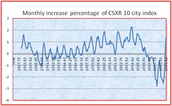
Home prices increased by 1.4% from May to June 2009, according to recent Case Shiller data.

Here we use the CSXR 10 city index. This index showed a month to month percentage increase in home prices of 1.40%, and that the year to year increase was -15.13% (from June 2008 to June 2009).

The graph below shows the percentage month to month changes in the CSXR index. These are monthly percentages and are not annualized. It seems clear that home prices are on the increase again. A respectable increase is seen at the right side of the graph.

Monthly percentage home price 
increases

The 1.4% monthly increase translates to a very high yearly percentage. The real interesting question is what next month's data will show.

Tags: case shiller home prices, home prices, housing, housing price graph.
Case Shiller home prices through March 2010
7th June 2010

Case Shiller had stopped publishing its data in spreadsheet format. Or at least I was not able to locate their data in this format. I recently noticed that their data seems to be available in spread sheet format again, so I have resumed doing house price analysis. The analysis here is very similar to what I have been doing in the past but the data has been updated.

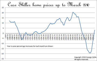
The graph below shows the percentage increases in home prices from year to year. That is, this is a 12 month price percentage change.

Year to year percentage home price increases

From March, 2009 to March, 2010, home prices have increased 3.15%. This is the right most point in the graph above. We have used the Case Shiller CSXR 10-city composite index in this analysis.

Tags: case shiller home prices, home prices, housing, housing price graph.
Case Shiller home prices through April 2010
29th June 2010

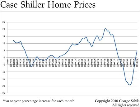
The graph below shows the percentage increases in home prices from year to year. That is, this is a 12 month price percentage change.

Year to year percentage home price increases

From April, 2009 to April, 2010, home prices have increased 4.61%. This is the right most point in the graph above. The 12 month percentage gains appear to be increasing since the number for last month (March) was 3.14%. We have used the Case Shiller CSXR 10-city composite index in this analysis with non seasonally adjusted data.

Tags: case shiller home prices, home prices, housing, housing price graph.
Case Shiller home prices through June 2010
31st August 2010

Case Shiller house price data for data up to June 2010 was just released. The numbers show nothing real surprising, and the basic trend of increasing home prices (compared to a year ago) appears to be continuing.

From June, 2009 to June, 2010, monthly home prices have increased 5.01%, whereas From May, 2009 to May, 2010, monthly home prices have increased 5.44%. (This latter number is slightly revised from a previous blog post.)

We have used the Case Shiller CSXR 10-city composite index in this analysis with non seasonally adjusted data.

The brief table below gives the 12-month home price percentage increases for the six months from January through June.

2010.00 -0.05
2010.08 1.46
2010.17 3.12
2010.25 4.60
2010.33 5.44
2010.42 5.01

In January home prices were still lower than they were a year ago, and since then they have shown increases compared to the same month of the previous year.

The year to year percentage increases are shown in the graph below.
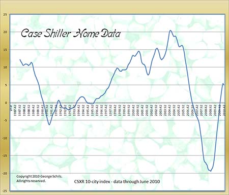
Year to year percentage home price increases

There is a very slight downturn in home prices (i.e., in the home price increase rate - this can be very hard to understand), as seen at the very far right of the graph. It is probably too soon to know if this is a glitch or a real trend. The "glitch" at the right therefore shows a slight deceleration of home prices. Inspection of the graph shows that numerous "false glitches" do occur and the next few months will reveal whether this trend is real or a bump in the data. Of course the publishers of the index already know the answer since the data they release here is delayed by two months.
Tags: case shiller home prices, home prices, housing, housing price graph.
Case Shiller home prices through October 2012
23rd January 2013

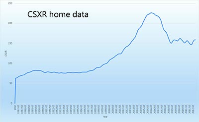
A plot of home prices using Case Shiller data is shown in the graphic below.

csxr home prices through Oct. 2012

This plot is of the 10 city csxr index over a time period from about 1987. The right side of the graph shows that the home prices have been somewhat wobbling over the last several years. It's not great news; but it's also not bad news.

The short table below gives some numerical values. Column 1 is the year, column 2 is the 10 city csxr index value, and column 3 is the year to year (12 month) percentage increase.

2012.00 148.00  -4.12
2012.08 146.64  -3.77
2012.17 146.46  -2.95
2012.25 148.45  -2.19
2012.33 151.75  -1.03
2012.42 154.97  0.06
2012.50 157.24  0.58
2012.58 158.54  1.30
2012.67 158.87  2.09
2012.75 158.77  3.41

It is seen that the October 2012 csxr value of 159 is 3.41% higher than the value one year ago.

Tags: case shiller home prices, home prices, housing, housing price graph.

RSS Feed

Created by Chronicle v4.6

The "George Schils Business Blog - BZ Bread -- Business, Finance, Economics - Applications for Math and Statistics" blog is copyright 2008-2013 George Schils.
All rights reserved.